Wednesday, December 20, 2023

Never delete tests

Ok, not never, but only delete them when they really serve no value and the codebase is improved by their removal.

As an example, I was recently told this test (well, one very like it) should be deleted.


[TestMethod]
public void CanCreateInstance_WithoutError()
{
        var sut = new MyCoolClass();
   Assert.IsNotNull(sut);
}


I was told this provides no value, and the code path will be covered by one of the [many] other tests [that exist and will remain] so I should delete it.


Firstly, I originally created this test before `MyCoolClass` existed, and the test only threw a NotImplementedException. I created test cases for what I knew I would want to implement. This allowed me to have Test Drive the Development and tell me when I was complete--because all the tests passed.


Ok, but that was then. The class has now been implemented, and many passing tests exist. Is it still worth keeping? 

Secondly, I think there is long-term value in having such a test:

  • It documents that it needs to support a parameterless constructor. If an additional constructor was added, this test shows that there's logic dependent on supporting a parameterless constructor.
    Yes, the compiler will complain if other code depended on such a constructor and one no longer exists, but part of the purpose of the test is to document the design intent behind the code. Here; the test documents that a parameterless constructor was intended and an instance can be created without any dependencies. If we start adding dependencies [or injecting them?] into the constructor, then this test tells us (hopefully) that we may need to revisit the expectations and wider implications of such a change. We may be able to get the code to compile after such changes, but are we breaking some subtle design intentions and decisions that were part of the original design and which may have implications that aren't immediately obvious?
    If there is logic in the constructor, this is especially important.--Even if there isn't any logic there now, it's good to have the test ready in case some is added.
  • It sets an example for other developers on the team that you want to encourage to write more tests. Having an example that shows all of the TDD process is better than only showing the part at the end. 
  • (Probably most importantly) This is useful when/if something fundamental breaks in the class. While technically, this functionality is exercised as part of all(?) the other tests, if everything else starts failing, but this doesn't, then we know the issue is not in the constructor. If this test fails, we know there's a problem in the constructor. We don't have to work it out from the other tests.
    Tests don't only tell us when something is wrong. They help us identify what is wrong when something breaks.
    I want to be able to look at the names of tests and see what they test. I don't want to have to work it out by looking at the data.  Looking at the names of the tests that are passing and/or failing should give me a clue where the problem is.


Why might I delete a test like this?

  • If we needed to support a constructor that does take parameters. (Although I may just modify this one.)
  • If this test was slow and the total execution time of all tests was an issue. Because this code is technically "tested" by other tests, I may accept that overall execution time is more important. In this case, it's not. This test runs in under 1 millisecond and is part of a larger suite that runs in a few seconds.


Finally, does debating whether to keep or delete this test constitute a good use of everyone's time?

There are many factors to consider:

  • How long does the test take to run? (Multiplied by every time it is run)
  • How much time is spent debating whether to remove it?
  • How long does the CI on the PR to remove the test take to run?
  • How long does it take someone reviewing test results to skip past (assuming they pass successfully) the results for this test?
  • How much time is spent navigating and reviewing the test while maintaining the code base? 

No, there often aren't easy answers to the above questions.

My default position on removing tests is to only do it when the test is wrong or is so slow that it has negative consequences on the development process/workflow (and so harms the business.)

I've never been in a position where the best use of anyone's time was to discuss and remove tests. (I even wrote this post in my own time.)

I can also only think of a handful of occasions where the execution time of a test (over the lifetime of a project) was more than the execution time of the CI on a PR to remove it. Even in most of those situations, the original test was kept, but moved to be less frequently run.


Sunday, December 10, 2023

Why I'm a [statistically] bad but also valuable developer

On one of the teams I've recently been working with, we have a channel in Teams for asking questions if you get stuck.

Officially, the guidance is that you shouldn't stay stuck for more than 15 minutes without asking for help.

The intention is that no one should be stuck for long without making progress.

I noticed that I was posting there more than most.

A quick review of the posts there in the last two months, and yes, I post there, asking for help, more than 15 times as often as other team members.

Some people manage to go months without asking for (or needing?) help!

I actually post on that channel more than I might. In starting to write about what I've already tried, I often come up with other ideas to try, and they sometimes pay off. (Maybe it would be more appropriate to rename it the "rubber duck" channel.)

15 minutes isn't very long to get stuck on something. Some of the things I've been working on recently are highly complex and can take hours to try the likely possible solutions I can think of.

But, as soon as I get stuck I ask for help.

There's no point asking for help when I haven't tried the things that are likely to be suggested. But once they're exhausted (and documented if I need to share them with someone who might be able to help) I ask for assistance.

When working as part of a distributed team, asking for help, even asynchronously, as soon as it's needed, is an important and valuable skill.

You don't want to be that person who waits to be asked if they're stuck or struggle for days without making progress. Such people are rarely good for a team.

We'd all love to never need help, but we can't all know everything. 
If you're doing new things (which may be most of the time) then you're bound to encounter things you don't know and need assistance with.

Asking for help isn't (or shouldn't be) a problem. It's the people who don't ask for help that you need to watch more closely. They may be brilliant. They may be struggling.


Yes, my initial statistic doesn't allow for anyone asking other people for help directly. I can't measure that. But I do know that in large, distributed teams, it's hard (impossible?) to know who is the expert on every topic and who will be able to provide the quickest response due to time zones and flexible working patterns.


"Why an MVP shouldn't use their extensions to hijack a developers GeneralOutputPane in Visual Studio to solicit sponsorship and to use it as their own personal advertising space via a class called SponsorRequestHelper.cs."

And the answer is...because entire teams will no longer use the extensions. Because its not cute, it's distracting. Because it's not witty, it's inappropriate. And because I don't believe that blackmailing developers with removal of the nag once they sponsor you is very becoming of an MVP. While I was looking forward to using some of your extensions after a MAUI webinar I attended the other day, sadly, our team will not be using any of your extensions. And hijacking these special method handling attributes is irresponsible, because Im pretty sure Microsoft wont agree that your desire for sponsorship is in any way SPECIAL or more important than the runtime in which you are hijacking.

MAUI App Accelerator v1.4

Consider this a low-key announcement that version 1.4 of MAUI App Accelerator is now available in the Visual Studio marketplace.

This version adds support for building apps with .NET 8.0. 

Replacing occurrences of "net6.0" with "net8.0" might seem very simple, and probably is, but there was a lot more involved in the changes for this new version. 55 commits were made over 286 files.

There's also been significant testing involved. Combinations of all available options and just a single page produce 570 combinations in a generated app. And I also have tests for combinations of pages too!

A massive thank you to everyone who supports me via GitHub Sponsors. As a one-off or on a recurring basis (for any length of time), all sponsors make a massive difference and are a great encouragement. It's a pleasure to add each [non-private] sponsor to the list whose avatars are included at the bottom of the wizard.


When some people are so critical and demanding of open-source projects and developers (more on this soon), it's great to know that there are people who are supportive and encouraging of what I do.


Is MVVM still relevant or useful?

Thinking out loud (or rather through typing) here.


The MVVM pattern has a problem: everyone has a different definition of what it is and how it should be implemented.

"Everyone" thinks their understanding is the correct one, and doing it a different way isn't the "proper" way of doing it.

It was always intended as a loose structural guideline and principles rather than as a highly prescriptive way of writing code.

Maybe it's just me, but I still hear more discussion and focus on the use of MVVM as a "framework" than on other aspects of making a great app and creating an easily understandable and maintainable codebase.


Two key benefits that MVVM was initially intended to provide don't seem all that relevant either.

Reuse - When a ViewModel was referenced in separate solutions that each targeted a different platform, abstracting logic away from the UI to easily be reused in multiple solutions/apps made a lot of sense. When using MAUI, Uno, or Avalonia--where a single solution can produce apps for multiple platforms--using an architecture that structures code for reuse when none is needed risks adding unnecessary complexity.


Testability - most ViewModel code (still--sadly) goes untested. If you're the exception, congratulations. So, doing something for the sake of testability but then not creating tests seems a bit unnecessary. (At best.)


So what to do instead?

I don't have a single answer.

I know there are things like MVU and MVUX, but I just wanted to write this to get my subconscious thinking about the idea...


Tuesday, November 28, 2023

One test is never enough!

One part of creating coded tests for software is being able to know when something doesn't work as it should, not just confirming that something does work as expected. 

Imagine if you didn't. Consider a test that tries to verify that given X input you get Y output.

If you write a single test for this, you might be confident that when you input X, you do get Y out.

But, what if you input Z and still get a Y out when you shouldn't?

You probably also need a test for Z input too.


Actually, even having two test cases probably isn't enough.

If you're testing more than a simple boolean input, there are a lot more cases that you should probably be testing too.


I thought this went without saying.

I guess not. 

So now, I've said it.

Thursday, November 23, 2023

This looks like a NuGet bug - but isn't

Error NU1301 The local source '[PATH]' doesn't exist.

I recently reported a bug where I was trying to use an updated version of a NuGet package. When I specified a new version of that package (in Directory.Packages.props), I got build errors complaining about a path to another project in the solution.

I got the error message shown above, but the path was relative to another project in the solution.

Very odd.

Why would the newly updated package version do anything with the referenced path?


It turns out it didn't.

But, it took me two days, and then the answer popped into my head while walking back from the shop, to explain what was happening.


A couple of days earlier I'd been testing the package created by another project in the solution.

To do so, I'd created a local package source that pointed to the output path of that project. [Those of you paying attention will have already guessed that this is also the path from the error message that started all this.] Then in a different solution, I could load my test project and add a reference to the package I'd built for testing.

All was good. I tested that package and carried on with my work.


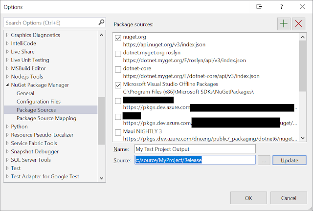
Here's an example of the package source I created for testing. [Ignore the parts that are obscured. They're not relevant.]

See the path I'm setting in the image: "c:/source/MyProject/Release".

The Package Sources Window - showing a custom configured source
If this path doesn't exist when creating (updating) the source entry you get a helpful error message:
Package Manager Options - The source specified is invalid. Please provide a valid source.

That's a good, clear error message. It clearly makes known what's wrong.

Now, guess what happens if that path exists when the source is created but is later deleted.

It's a reasonable scenario. Create a local package source for testing and then later delete the directory when testing is finished.

Or rather than explicitly delete it, maybe you reset a branch, and that causes the path to be deleted.


That's what I did.


Then, a few days later I try and add a version of a package I've never used before.

And that's when I got the error.


So, what's going on?

Well, what I assume is happening is that before downloading a new version of the package, it checks all the configured sources to see if it exists in any of them. It (the download manager) doesn't know that the package only exists on nuget.org and quite rightly checks all configured options before downloading something again unnecessarily.

Except, in my situation, it's now trying to look in a directory that no longer exists which causes an exception.


There's an argument that it might be good to add an option to ignore local sources that don't exist but I expect that to be likely to also cause a number of obscure exceptions that aren't obvious to diagnose.


I expect if I had tried to use the UI to update the package version rather than directly editing the props file I'd have got a different (and probably more helpful) error message. - [Actually, I've just checked and  it's the same error message but seeing that I'm using ALL Package sources may have helped me spot what's wrong.]


So, not a bug in the package I was trying to use, and not a bug in the projects that reference that package.

If anything, this is just a limitation of options for testing a package locally and poor error messages.


Or it's me being an imposter for thinking I knew how to use Visual Studio and NuGet. 

Or, it's me being stressed and making silly mistakes with configuration.

Or, it's another reason for someone to complain about my code. There's been a lot of that recently. :(


Or maybe it's a reminder for all of us to only keep local NuGet package sources enabled while they're needed.


Saturday, November 18, 2023

Review: Learning WinUI3 (2nd edition)


I bought a physical copy of the first edition.
I was given an electronic copy of this (2nd) edition.

I twice tried to post a review on Amazon but they refused it based on unspecified "community guidelines".
Here's what I tried to say:

Probably the best book available on learning to develop with/for WinUI3. 
This updated version provides a comprehensive introduction to WinUI3 development and the broader required knowledge to help gain a firm grounding in its use.
The new and updated chapters help keep the book relevant with a platform and ecosystem that has evolved since the release of the first edition.
If you want to learn about WinUI3 from a book (rather than videos, etc.) then I recommend this one.

Monday, October 30, 2023

Rethinking "code-adjacent" talks

I've been thinking about the talks people give at technology conferences and user groups.

Not the ones that explain, "Here's a specific technology," or "Here's how to use a certain API," or even "Here's how to create an API."

I'm thinking more about the ones about less specific subjects. Topics like choosing between design patterns, thoughts about ways of working, project organization, communication, prioritization of tasks, who should do what, and the like.

I'm not sure of a universally understood term for these things, but let's use "code-adjacent" to talk about things related to the code (and the way we write it) rather than the code itself.

These topics are never purely objective but are highly influenced by context and subjective opinion.

And now we get to the idea of giving talks on these subjects.

I recently attended a conference with many such talks, and it struck me how popular these types of talks have become and how easy it is for presenters to accidentally treat opinions as fact or their experiences as universally true.

[I waited a few weeks after the conference before posting this to try and avoid direct criticism of individuals.]

I suspect many people listening to these talks didn't know or notice where the speaker was doing this.

At the conference where I started thinking about this, I heard:

  • Questionable opinions being passed off as absolute facts.
  • "Facts" that were demonstrably false.
  • Broad dismissal of topics that the presenter acknowledged they didn't enjoy or understand in detail.
  • Things that are true in the speaker's limited and highly specialized experience being taught as always true in all circumstances.
  • A detailed discussion of scenarios that may have been relevant 10 years ago but which modern tooling, techniques, and best practices make redundant. 

 I wonder how many attendees (especially less experienced ones--there were many students in attendance) left, not realizing there was a lack of nuance expressed in what they were told.

These talks are often also shorter, so have less time for questions or clarification. The talk ended when it got to the end of the time allocated, and then everyone filtered off to other rooms for subsequent talks.


As an attendee, I want the best, most up-to-date, fact-checked information from experts.  Or, I want people to share their opinions and experiences while clearly justifying and explaining these.

As a (sometimes) organizer, I want speakers who have thought out, planned, checked, and verified what they will say. I don't want speakers who will do the bad practices mentioned above. I want the best for the attendees. I don't want them to say, "That was a bad speaker," because that quickly becomes, "That event doesn't get good speakers," or "I was given bad advice or incorrect information at that event--and so won't go back." 

As a speaker, I know it's all about the audience and giving them the best information in ways that will help them remember and be able to apply the knowledge I'm sharing. I get the impression from some speakers that they think they are the experts and must be right as they are the ones talking from the front, and so no one else matters. (Basically, they make it about themselves rather than the audience.)


What if these talks were done differently?


What if talks of this nature had (at least?) two different speakers. Ideally, with very different experiences and opinions.
Maybe they do the talk together.
Maybe they do shorter talks back to back.
Maybe one gives a talk, and the other has time at the end for rebuttal or clarification or to give counterpoints or counterexamples.
Or, maybe you can't get more than one expert on a subject, so you get a small group of senior, experienced, and broadly knowledgeable people to lead questions and clarifications at the end.


Will this be more work? Possibly.

But wouldn't that give a much better experience to attendees?


But what if the presenter is worried about being contradicted or having their errors pointed out?

Well, do you want speakers who have that attitude?

Do you want the audience to be given bad or incorrect advice?

As a (sometimes) speaker and presenter, I want to know if the information I'm giving is incorrect, outdated, easily misunderstood, or otherwise wrong. I want to know for myself, and I want to know for the people who will hear what I say.


I'm currently planning and preparing a talk on the importance and value of documentation and testing for software developers. It's potentially challenging (to hear) and will contain much that is highly subjective, but I think it's very important, and I have valuable advice to share on the subject.

I'm not yet at the point where I'll welcome criticism and objections to what I have to say, but I know that there are people with different opinions, and I want to know and acknowledge these.

A talk that's just "These are my thoughts on this subject." is far less valuable than "Based on these experiences, I have these thoughts about this subject, and this is why it could be useful for you to know."


Thoughts?


Wednesday, August 02, 2023

4 times I got "sherlocked" by Visual Studio

"Sherlocked" - But, not in relation to the detective or associated fandoms.

Benedict Cumberbatch as Sherlock Holmes with a line across the image

It's the name used when functionality that was provided by an app or extension is incorporated into the OS or program running the extension. (ref1, ref2)


Here are 4 times that tools and extensions I've built to make it easier to work with Visual Studio have been "sherlocked".


1. UWP Design Time Data

Back in the day (prior to version 16.7 of Visual Studio), there was no way to see data-bound values in the designer of UWP apps. So I made a NuGet package that made it so you could. 
My approach was only ever intended as an interim solution as this functionality had been promised. I just got fed up of waiting.
Sadly, neither WinUI3 nor MAUI has Visual Designers, and so the relevance of all this is now moot.


2. Collapse usings on file open - part of Collapse Comments

Collapse Comments started out as an extension that only operated on comments. Over time, and thanks to feedback, some functionality was added that related to working with using directives too. This included the ability to collapse them when a file was opened.

Options for Collapse Comments extension

Then, in April 2022, this capability was also added to Roslyn.

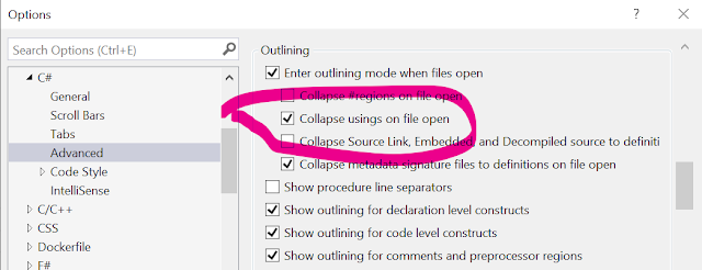
Options Windows showing the Advanced Option to 'Collapse usings on file open'

I started working on the extension in 2018; an official request was made (by someone else) to have the functionality in Visual Studio in 202 (apparently JetBrains Rider already did this), then in 2022, VS did it too.
Someone on the Roslyn team reached out to let me know they were making the change. Which was nice.
The extension still exists as all the other functionality is unique and not built into VS--yet.

This is an encouragement that I am making valuable things with much broader potential reach. Note to self: work on marketing more.


3. Solution File Diff

Wanting to compare two files is a common task but something that was built-into Visual Studio prior to version 17.7 preview 2. My solution was often buggy so that this now exists is much better :)

If you're not yet using that version of Visual Studio (or above), you could also try FileDiffer.


4. Always Include

This was an experimental tool I created before C# has global and implicit usings. Whenever you opened a C# file, it would ensure that the using directives at the top of the file included a set of namespaces that you could configure.

Global and implicit usings make this almost entirely redundant now. However, I'm thinking of applying something similar to XAML files to apply a consistent set of XML namespace aliases to all files. - Let me know if this interest you too.


In addition to the above, I still have lots of extensions in the marketplace that provide other functionality that Visual Studio doesn't. Yet.....?


Saturday, July 29, 2023

Why does writing XAML have to be so slow?

This article is a part of the .NET MAUI UI July calendar—a month-long list of content around .NET MAUI from the developer community, curated by Matt Goldman.


There are many potential criticisms of XAML. Some people want to abandon it entirely and just use C# to create their UIs. I think that introduces other issues (that I'll expand on in a future blog post), but it also doesn't do anything for the people who like working with XAML and/or already have a lot of it, and for whom completely rewriting that code isn't an option.

Rather than write XAML off, or sit and complain, I'm interested in different ways of writing XAML that address some of the criticisms and in providing tools to make it easier.

This post is about one such new tool. I was excited to try it out and have been impressed by the difference it's made to my coding (once I'd gotten used to working in a different way).

Firstly, two pieces of background:

1. About 20 years ago, I was involved in hiring a web developer. (Obviously, web development has changed massively since then, but this story is still relevant.) One of the people we interviewed was really keen on pointing out how they thought it was important that they wrote everything by hand and didn't use an IDE with any tooling that made writing code easier. I don't agree with this attitude, and that's probably part of the reason I still remember the conversation (especially given how bad at remembering other things.) Yes, it's great to have full knowledge of a topic and be able to do something without assistance, but that assistance may save valuable time. If you have someone with deep or expert knowledge, isn't it better to have them focus on the tasks that use that knowledge rather than simple tasks that could be automated or accelerated?

2. Reading one of the many threads about developer frustration with the lack of tooling for WinUI3, I was prompted to think again about the Toolbox inside Visual Studio. Someone was complaining that the Toolbox isn't populated for WinUI3 projects. Having not used a drag-and-drop interface designer for many years, I'd only really thought about the Toolbox as a place to store code snippets. What if it could be useful for writing code directly in the editor too?


This is the Toolbox window (initialized within a .NET MAUI project) - it has groups (Controls, Layouts, Cells, and General) and items within each group.

The Toolbox window showing groups and items

That it's also possible to add arbitrary pieces of code (AKA snippets) into the toolbox made me think about the other snippets that are supported by Visual Studio.

The Code Snippet Manager window filtered to the XAML Language

These two types of "snippets" got me thinking:

  • Snippets in the toolbox are visual (and so more easily discoverable) but limited in functionality.
  • "Code snippets" have more functionality but aren't visible/discoverable.

What if there was a way to combine the two?

Before I continue, I should probably point out something many developers aren't aware of. You can use the items in the Toolbox with the XAML editor? (or any editor window.)

  • You can drag an item onto the editor, and it will add the XAML for the control at the point where you drop the item.
  • If you double-click on an item and it will add that same XAML wherever the cursor is.

🤯

Give it a try:

Open a new .NET MAUI project and drag a Button onto the editor. You'll see it adds the following:

<Button Text="" />

Or, double-click on the ListView and see it adds the following:

<ListView><ListView.ItemTemplate><DataTemplate></DataTemplate></ListView.ItemTemplate></ListView>

That's good, but it puts the cursor after the closing element. Not if you then want to add content to the DataTemplate.


Notice also that the items in the Toolbox don't include some of the things you're likely to use most in a .NET MAUI codebase. I suspect that this list is actually from the historic Xamarin.Forms functionality still in the underlying code base.


Perhaps I can do something "better"?


Introducing  Pro XAML Toolbox 

It's only one window, but here it is in dark and light themes.

Light and dark theme versions of the Pro XAML Toolbox inside Visual Studio

Ok, it doesn't look like much, but let me explain. [prefer to watch rather than read? - see this video]

It's an intended replacement for the built-in Toolbox when it comes to working with XAML in a .NET MAUI project.

The main goal is to get boilerplate code written faster. This can then be modified as necessary for the requirements of an individual app.


Boilerplate code is often challenging to work with, and different approaches are taken to remove or work around it. I'm not able to change the language, so it's not needed, and for XAML, there isn't an easy way to use code generation or compiler trickery to make it unnecessary. So, I've chosen to try and make it so that there's less need to type it yourself.


Let's look at a couple of examples.

Example 1 - A login screen

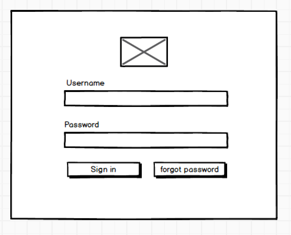
Imagine you wanted to create a login screen like this: It has an image at the top, two input fields for the username and password (each with a label above), one button to "sign in", and one for if the person has forgotten their password.

mockup of a login screen, showing: image placeholder, 2 labels followed by text fields and 2 buttons

If you're familiar with .NET MAUI and writing XAML this probably doesn't look too complicated to implement. You're right. It shouldn't be hard to implement this. You could create this quite quickly and without too much thought.

However, it's even easier and faster to create the basic scaffolding of this UI with the Pro XAML Toolbox.

All you need to do is set the cursor in the editor and then double-click on the appropriate items in turn.

That's: VerticalStackLayout > Image > Label > Entry > Label > Entry > HorizontalStackLayout > Button > Button

So, nine items double-clicked, and it produces all this code (here shown formatted):

<VerticalStackLayout>
  <Image Source="PATH-TO-IMAGE" />
  <Label SemanticProperties.HeadingLevel="Level1" Text="CHANGEME" />
  <Entry Placeholder="CHANGEME" Text="{Binding PropertyName}" />
  <Label SemanticProperties.HeadingLevel="Level1" Text="CHANGEME" />
  <Entry Placeholder="CHANGEME" Text="{Binding PropertyName}" />
  <HorizontalStackLayout>
    <Button
        Command="{Binding CommandName}"
        SemanticProperties.Hint="Add a description of what happens when clicked"
        Text="click me" />
    <Button
        Command="{Binding CommandName}"
        SemanticProperties.Hint="Add a description of what happens when clicked"
        Text="click me" />

  </HorizontalStackLayout>
</VerticalStackLayout>


If I started to create this myself and only used the keyboard, 9 keystrokes gest me this much code:

<VerticalStackLayout>
    <Image Source=""
</VerticalStackLayout>

I've clearly saved a lot of keystrokes and, therefore, time. Also, possibly, a bit of mental effort too.

It's not just the amount of code I've gained. I did it all without having to move the cursor. When I added an element likely to have child elements, the cursor was automatically positioned accordingly.

I've also got attributes for the properties I'm likely to need to set, and there are suitable default values with prompts to change them too.


Example 2 - A list with an item template

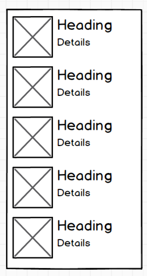
Here's another common scenario. We want a templated list, and each item in the list should contain an image with two pieces of related text beside it.

A placeholder mockup of a list. Each item in the list has an image with two pieces of text beside it

Again this is very simple to create yourself, but you shouldn't have to write it all by hand.

Let's set the cursor in the desired position and double-click some items in the Pro XAML Toolbox.

CollectionView > Grid > Image > VerticalStackLayout > Label > Label

That's six items that we've double-clicked, and it's provided all this code (again, line breaks and formatting have been added):

<CollectionView
  ItemsSource="{Binding PropertyName}"
  SelectionChangedCommand="{Binding CommandName}"
  SelectionMode="Single">
  <CollectionView.ItemTemplate>
    <DataTemplate>
      <Grid ColumnDefinitions="*,*" RowDefinitions="Auto,Auto,*">
        <Image Source="PATH-TO-IMAGE" />
        <VerticalStackLayout>
          <Label SemanticProperties.HeadingLevel="Level1" Text="CHANGEME" />
          <Label SemanticProperties.HeadingLevel="Level1" Text="CHANGEME" />
        </VerticalStackLayout>
      </Grid>
    </DataTemplate>
   </CollectionView.ItemTemplate>
  <CollectionView.EmptyView>
    <ContentView>
      <StackLayout HorizontalOptions="CenterAndExpand" VerticalOptions="CenterAndExpand">
        <Label Text="Nothing to see here." />
      </StackLayout>
    </ContentView>
  </CollectionView.EmptyView>
</CollectionView>

Notice how the Grid is automatically put inside the DataTemplate and the Image inside the Grid.

I tried to type the above by hand and got this far with 6 keystrokes:

<CollectionView I

Intellisense helped a bit, but that's as far as I got. :(


But, you might point out, the generated code isn't finished!

No, but it is ready for you to make the specific tweaks you need. This could be removing the RowDefinitions from the Grid and specifying the Column that the VerticalStackLayout should be in. Both of which are trivial. And then you'll need to replace the placeholder text, but again that's easy. Yes, easier than typing the whole thing yourself


Your value is in producing finished software that provides value to those who use it.
Your value is not in the number of keystrokes you make or the amount of code you write.


Options/Configuration

But what if the generated code shown above isn't to your liking or preference? - You can configure it.

close up of the available options

Prefer to use events rather than commands? It's an option.
Don't want to include common (or recommended) accessibility/semantic properties? You don't have to.
Want every element to have an 'x:Name'? You can.

And the options to change these while you work are always accessible (not hidden away in a separate place), so you can easily and quickly change them while working on a file.


If (and when) there's some magical tooling (AI?) that can automatically give you everything you need to create a desired UI, then great. I'll happily use it.

For now, and until then, we can write code and build software much faster by using tools that do the easy, generic, and standardizable bits for us.


No, it's not the same as having a visual designer (something I know many people want, but Microsoft aren't likely to provide any time soon), but it's much faster than writing all that code by hand!


My hope is that others will find this useful too.

  • It's not a panacea or a silver bullet.
  • You don't have to use it.
  • It's not perfect for everything - I still write XAML by hand as well as using this.
  • It doesn't remove the need for other tools. (I have other tools to generate code in different ways)
  • But it could be another tool in your (pardon the pun) toolbox to help you create high-quality software faster and more easily.


Please install it, try it out, and let me know your thoughts.

I've already created issues to track some of the things I'd like to add and would love for you to add your ideas too.

And yes, there is likely to be WinUI/UWP and WPF support coming soon if other people want it.


Monday, July 10, 2023

UI summary representation without a treeview?

I tried to start this discussion on Twitter & Fosstodon but didn't do a good job of describing things with limited words.

I'm trying to find examples of the summary representation of a UI (could be a web page or a native app) which don't use a treeview.

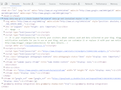
For instance, assuming you're reading this in a browser, open the developer tools (F12), and you'll see something like this in the Elements tab. All the triangles are expandable and collapse nodes. You can expand an entry to see its children. It's a basic "tree view" layout. 

Example of the homepage of this site in the Elements tab of the developer tools

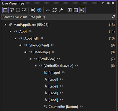
Or, for an app, here's the Live Visual Tree from Visual Studio

Partial screenshot of the Live Visual Tree tool window in Visual Studio

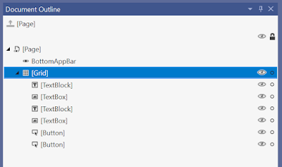
and the Document Outline

partial screenshot of the Document Outline tool window

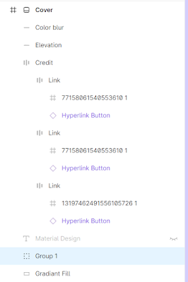
Or this from Figma:

partial screenshot from Figma.com


They're all tree views.

I'm looking for examples of alternative UI for representing all (or part) of a UI "tree".

Got any examples?

I'm most interested in examples intended for developers that are clear and easy to understand. Or, at least, explained. Not different for the sake of it, but that are trying to communicate something different or in a different way.


My thought process was triggered when someone told me this is the only way this can (and has) to be done but couldn't tell me why.  I'm also suspicious that this might be leaking the abstraction of the underlying data model when this might not always be the best or most suitable thing for the person viewing it.

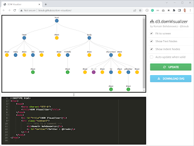
The only real variation I can find is like this (from http://bioub.github.io/dom-visualizer/), but all that really does is flip the axis.

screenshot of http://bioub.github.io/dom-visualizer/


Before I spend time exploring different options, I'd like to know why "everyone" does it the same way or if others have tried doing different things and what they learned from the process.

Know of anything?


Saturday, June 24, 2023

Code therapy (AKA: Lessons from a "mental health" Hack Day)

I'm halfway through my drive to the event and have stopped at a well-known coffee chain. While I wait for my drink, I see a poster on the "community noticeboard" advertising an art therapy course. It strikes me that there's a similarity between such events and how I'm planning to spend my day.


It starts a few months earlier when lamenting how depressing it can feel when work isn't satisfying.

Part of the reason I'm a software developer is that I like the job. I like the aspects that are creative problem-solving. 

I get pleasure from creating something that makes other people's lives better or easier. Even if only in a small way.

The satisfaction I get from shipping something new (even if only an update) energizes me.


But sometimes work is tough.

Sometimes it feels like days or weeks go by without real progress.

Sometimes a task that can bring joy and energy can suck!


Sometimes, the bad parts of the day can be offset by doing personal, fun projects in the evening.

But then there can be extended periods when life, family, and other responsibilities take priority.


So, we hatched a plan. What if we set aside a day to focus only on fun personal side projects? It doesn't matter what you work on as long as it makes you happy.


And for a few people, in certain circumstances, it can be a lifesaver.


Sitting on a bus heading into Cambridge, I'm excited about what today may bring.

I have a whole day (the room booking is for 8 hours) and can do whatever I want.

I've got quite an extensive list.

I know I won't even get halfway through it, but the prospect of completing any of these things that have been in the back of my mind, waiting for the right opportunity to get started, excites me.

This is going to be a great day.

It doesn't matter that only half a dozen people are expected.

Selfishly, this is all about me. It's my chance to do the things I want to do.

That I don't need to worry about the logistics of managing lots of other people is a blessing.


We booked a bigger room than we need and invited lots of other people in the hope it might benefit them too, but if no one else turns up, it's better for me as I'll have more time to focus on my projects.


The reason for booking a room somewhere is that it helps avoid the distractions of home. There's no Xbox or TV here to tempt my attention. There are no family members to knock on the door.

That this is weeks in coming means, I've primed myself to think that today is special. Days like this don't come around often, so I want to make the most of it.


That others have thought the same and turned up is an additional encouragement to make the most of this opportunity. Plus, we have the time and space to have niche, technical conversations that we don't get the chance to have elsewhere.


I knew my list was unrealistic. I knew that as I added more items to it, I will end up crossing off fewer things than I initially hoped.

But I also knew that doesn't matter.

Because, as time goes by, I am getting things done. The project that's been niggling away in the back of my mind for the last few months is slowly creaking out of my fingers, through the keyboard, and into my laptop.


And it works. In my mind, I always knew it would, but now I can prove it. I can see it running in front of me. 

It's far from finished. Far from something other people could use. Yet. But it's slowly taking shape.

I'm well beyond proving this concept. This is going to be a "real" project.


Can't stop for lunch.

No time.

Don't want to stop. 

Making this progress feels too good to interrupt.


That list I started writing last night (and added to this morning) no longer matters.

I know I'm not going to cross anything off it.

But the sub-list for the first thing I chose to work on has more items completed than not. And I know that more ticks are coming soon.


It's not a "proper" hackathon, but I start to get into a hackathon mindset.

As we start to think about when we'll have to leave, I decide I need to treat these last two hours as if I was preparing for an end-of-hack presentation.

How much can I get done before time runs out?

How can I best get this in a position to demonstrate it to others?


There's no competition. There are no prizes.

But I know that feedback from others will encourage me to keep working on this in the weeks ahead. (Whenever I get the opportunity.) The encouragement of others is likely to help me strive to make some opportunities.


The entry in my calendar for today says "destress hack." This is the placeholder I put in when we first booked the venue.

Officially we called it a "mental health hack." I assumed that "mental health" was more appropriate for communicating the idea as it's such a widely used term and--in my mind at least--more socially acceptable and supported.


Regardless of the name, this was unlike other hackathons. No theme or topic. No competition. Simply a challenge to myself.


But really, it was like the activity on the poster I saw this morning.

This was therapy.

It might not be art, but I feel better for it.

This has made me feel better about life. And work. And myself.


Thursday, May 25, 2023

MAUI App Accelerator version 1.3 is now available!

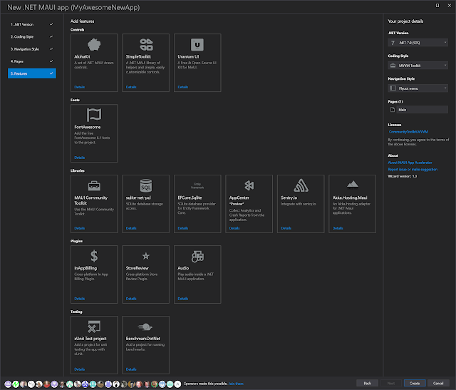
TLDR: Go here and download it. In addition to bug fixes, it adds a new page and 6 new features you can add to the generated app. 


Screenshot of the the Features step showing 15 options in 5 groups
Yes, this list is getting very big!

I'll be honest; this release has taken longer than I expected and isn't as planned. If you're following the activity on GitHub, you'll have noticed that most of what was originally planned for the 1.3 release is now scheduled for v1.4.

That's probably not what you're here for though. Here's what's included in this release.

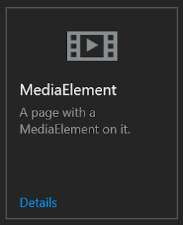
A new page: MediaElement

MediaElement option in the wizard
A simple page that includes the MediaElement control. This is for you if you want to play videos in your app.


New Features:

BenchmarkDotNet

BenchmarkDotNet option in the wizard
Add an additional project to the generated solution that is set up to run performance benchmarks on your code with BenchmarkDotNet.


EFCore.Sqlite

EFCore.Sqlite option in the wizard
Add a reference to the Entity Framework SQLite library so you can work with SQLite databases with Entity Framework.


Akka.Hosting.Maui

Akka.Hosting.Maui option in the wizard
Use Akka.NET actors in your .NET MAUI app.


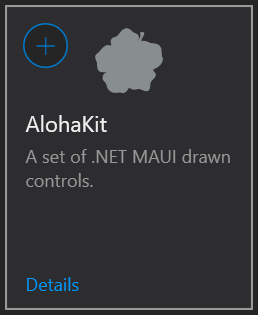
AlohaKit

AlohaKit option in the wizard
Add a reference to the AlohaKit control library to use their controls in your app.


SimpleToolkit

SimpleToolkit option in the wizard

Add a reference to the SimpleToolkit control library to use their controls in your app.


Uranium UI

Uranium UI option in the wizard

Add a reference to the Uranium UI library to use their controls in your app.


If you've made it this far and haven't already, install the extension or update it if you already have it installed.

https://marketplace.visualstudio.com/items?itemName=MattLaceyLtd.MauiAppAccelerator


Suggestions for what else to add is appreciated, as are reviews, and sponsorship.


Wednesday, May 10, 2023

Three years with GitHub Sponsors

I'm trying to be a bit more intentional about my career, money, and where I spend my time/effort. As part of this, I thought it might be interesting to look at my sponsorships via GitHub Sponsors.

I know many people publish full income reports. I don't feel confident enough to do that, but I hope that some of this analysis will still interest others without monetary sums.


Here's the key graph. It's the total amounts received each month.

Line graph showing many peaks and troughs but generally heading up and to the right

While not a smooth graph, it's definitely trending up!

Public vs private sponsorships

There are two broad ways of grouping sponsors. Those that are public or private; and those that are one-off or recurring.

Let's look at the public vs private distinction first.

It's easy to see who the public ones are. Their avatars are shown on my sponsor page.

Avatar images of present and past public sponsors

To save you from having to count, that's 35 public and 12 private.

The only difference to me is that I don't publicly thank the private ones by name.


But are there any differences between the different types of sponsors?


Different amounts from different types of sponsor

The figures in blue (on the left) of each group are the averages from all sponsors. However, as the very spikey graph above might suggest, there have been a few sponsors choosing larger amounts which skew things slightly.
The orange bar excludes the largest and smallest value from each group when calculating the mean.


Recurring sponsors typically pay less each month than a one-off sponsor. This isn't surprising and is almost encouraged.
I found it pleasantly surprising that amongst one-off sponsors, private sponsors pay about 17% more. I'm unsure why or how to use this information, but it intrigues me.


I didn't separate the public and private recurring sponsors, as only one is private.

But averages don't tell the whole story.


Total amounts from recurring vs one-time sponsorships

Unsurprisingly, while I have many fewer recurring sponsors, and the monthly average from each one is less than a one-off sponsor, the total amount from them is nearly three times the amount from one-off sponsorships.


Pie chart - 1/4 representing one-off sponsors and 3/4 for recurring sponsors

I'm not sure this graph needs a legend, but the blue wedge is the total from one-off sponsors, and the green section is from recurring sponsors.


Who I sponsor

I currently only sponsor 1 person through GitHub Sponsors, but I sponsor 6 people through Patreon. Again, without using actual figures, it's only in the last couple of months that the amount I receive through sponsorships is more than the amount I give via Patreon. It's the circle of creative people supporting each other.


Other "interesting" things I noticed during the analysis

One person has made multiple one-off sponsorships.

One person started out by making a one-off sponsorship and, a few months later, came back as a recurring sponsor.

Recurring sponsor durations vary greatly. From 2 months to 3 years (and going). I see no discernable pattern to this.


In summary

While I'm not giving actual figures, I will say that the total for the whole period is about half of what I'd earn in a typical month of paid work. However, over the last three years, this has still been really helpful. As in the last 3.5 years, I've only had paid work for 8 months. (Yay, COVID!)

The most crucial point was when sponsorships helped pay the balance of an unexpected tax bill when I hadn't worked in nearly 2 years!

Now I'm nearly debt free again, and this makes me think about how I can (and should?) give more back to other creators who I want to support.


I also need to think about how, if at all, I can use the above analysis to help encourage more people (or organizations) to become sponsors. (Either of myself or others.)


Tuesday, May 09, 2023

Do you really need MVVM?

MVVM is a popular design pattern, but I think it is often misunderstood, and I frequently encounter people with strong opinions about how/when/where it should be used.

Is MVVM Appropriate?

It's a powerful and useful pattern, but I meet people who use it that have never questioned if they should. It's just "what everyone does" and has become a default for many people.

It being a default isn't necessarily a bad thing, but never questioning decisions can be.


The MVVM pattern allows for separation between the UI/presentation layer and application or business logic.
It is commonly understood to provide 3 potential benefits:

  1. Increased testability (for business/application logic).
  2. Reuse of business/application logic in different projects/solutions/apps.
  3. More easily allow different people to work on the UI and other layers simultaneously.


And yet, I see people who are the sole developers on a project, don't write any tests, and don't need to (re)use any of the code elsewhere being dogmatic about using a pattern for which they get none of the intended benefits.

I admit that there can still be other benefits to using the pattern, but it's always worth questioning whether you should use something if you're not getting (or don't need) the benefits it was designed to provide.


Are you strictly sticking to "rules" of "how things are supposed to be done" when you're not getting or using any of the benefits the pattern was designed to enable and encourage?


Saturday, April 29, 2023

What if your XAML code was much simpler?

Over the last 6 months, I've given talks at a dozen user groups and conferences. 

In those sessions, I've discussed some of the thinking and experimentation I've done over the last couple of years, exploring ways of improving how we think about and work with XAML.

With each talk, I've refined and expanded my thoughts based on feedback and discussions with attendees immediately afterward.  (Yes, I'm prepared to drive 4 hours each way for the chance to talk about XAML--I get it; that makes me an outlier.)

<simple:XAML Is="Possible?" />

I've been reluctant to share too much detail while I refine how I communicate these ideas. 

I can spend an hour talking about how C# best practices can be applied to XAML and how it makes a massive difference to the code you write, but no one wants to read that. (Please tell me if I'm wrong.)

I can also show you how I can take even a relatively simple XAML file and massively reduce the complexity. But the difference is so big it's easy to miss all the changes and understand why the differences are there.

As I start to work out how I can best share these ideas, I'm putting together small videos and pieces of writing to explain the differences and the tools I've made to help.

Here's a short video demonstrating one such tool that I released on my YouTube channel this week.

>

I'd love your thoughts on the video, and on the tool if you try it.


Thank you ElektroStudio for helping spread the VB love

I've built more than a few Visual Studio extensions.

Most of them only work with C# code.

I'd like to support VB.Net in more of them, but other priorities get in the way.

Const Visualizer is one that hasn't had the love it could have. It's really useful in some instances, but I haven't found the time to address the things about it that niggle at me when I use it.

Given that I haven't found the time to add the C# related fixes I want, you'll not be surprised to hear that VB support wasn't high on my priority list.

So, when I was asked about adding VB support, I had to acknowledge that it was only going to happen if someone else contributed it. Thankfully, ElektroStudios did just that, and now version 2 is in the marketplace with C# & VB.Net support.

I know that many people still use VB every day and that some of you even look to me for advice and tools on building with it. I wish I had more time to focus on supporting it, but maybe if more people contribute some of the work, we can build better tools for VB development together.

Whatever happens, thank you, Elektro, for your contribution.


Wednesday, April 19, 2023

global (and implicit) using directives - but for XAML?

One of the great things about .NET 6 and C# 10 was the introduction of global and implicit using directives. Namespaces that could be defined once and then made available to all C# files in a project.

These small features simplified code by reducing the boilerplate and noise at the top of each file.

As part of my exploration into how XAML files could be made better, I've been looking at whether something similar could be done and whether the duplication at the top of each file could be removed.

The top of a XAML file with all the namespace aliases highlighted
The five highlighted lines in the above image (and many like them) are in almost every file. I even have some files with many more aliases defined. 

These lines add noise and distraction. Plus, inconsistent use of XML namespace aliases across different files can become confusing and lead to errors and unexpected behavior. 

What if we could have all the namespaces (and aliases) defined in a single place and available to all xaml files in a project? With a file like this:

File showing just the xmlns statements from the first image

I decided to see if I could make this possible.

Because I have previously spent time looking at the internal .NET MAUI code relating to XAML files, I started there.

In theory, this idea is applicable to any flavor of XAML, but I wanted to start by creating a working example of what I was thinking as after having talked to hundreds of developers about thinking of XAML in different ways, I know that many have a hard time even considering something different to what they've always done. I hoped that showing what was (or could be) possible might help open imaginations more easily.

But it's not valid XML!

Before I started, I knew that there would be objections to this idea. 

I knew some would not like it because it is different.

I know some would not like it because it technically makes the document invalid. XAML documents are (or should be) valid XML documents and, as such, cannot use undeclared namespaces (and aliases).

I pressed on regardless. I knew it will make the document technically invalid, but I hoped that the benefits it might bring could outweigh this.
If going back to the C# comparison, a C# file that relies on namespace directives that are implicit or defined (globally) in another file isn't much good on its own, either. Similarly, a XAML file that is "valid" but makes references to types that are in other files is of limited use by itself too.
This wasn't enough to stop me.

Going through the XAML source, I soon discovered that XAML files are potentially read (and things done with them) in many different places in the code and in different ways. The small chance that this would be an easy thing to explore and experiment with quickly got smaller and dissolved away entirely.

But I pressed on.

My goal of showing a working example was quickly scaled back to be just the smallest proof of concept appropriate.

Rather than support multiple namespace aliases, I opted for just one. (xmlns:x="http://schemas.microsoft.com/winfx/2009/xaml")


And I got there. 

Look, here's a file without the "x" alias defined, but it still works.

A small XAML document without the "x" alias defined but still used

I know you're skeptical.

After all, look at those blue squiggly lines under the code where the "x" alias is used.

It turns out they're coming from the editor. It's trying to parse the document too.

As soon as I saw how frequently the MAUI code processed XAML content as XML, I thought this could be a problem. I had an increased concern that there could be a lot of other tools and features that relied on XAML files always being valid XML documents.

As a simple example, here's the dialog I see every time I save that file.

Information dialog: --------------------------- Microsoft Visual Studio --------------------------- Error in StylerPackage:  'x' is an undeclared prefix. Line 3, position 5.    If this deems a malfunctioning of styler, please kindly submit an issue at https://github.com/Xavalon/XamlStyler. --------------------------- OK    ---------------------------

Very early on in my thinking about this, I did worry that additional tools needing to be able to process XAML files could be an issue. It quickly became a bigger issue than I expected.


I've looked at lots of code that works with XAML files (and written a lot, too), and the majority of it does treat XAML as XML and uses framework-provided functionality.
In fact, to get MAUI to treat my modified XAML documents as valid XML, I ended up having to add the missing namespace alias declarations into the document each time it tried to process them.

This wouldn't have been the end of the world if such a modification was needed in one or two places, but this isn't practical on a such a wide level. There is too much code (inside VS, frameworks, extensions, and other tools) that assumes XAML files will always be valid XML files too.

[Aside: I assume C# was able to add features such as global and implicit namespace directives as it is responsible for the entire toolchain that reads, parses, and complies '.cs' documents. Any 3rd party code that isn't using Roslyn/CodeAnalysis libraries to do the work has to take care of any special scenarios like this by itself, but I expect very few do. It's not like XAML which has been around for a long time and always supported files being treated as valid XML.]


So, my experiment was a failure.

In part.

I'd learned that this wasn't a practical thing to implement and that the impact on the wider ecosystem was almost certainly going to be too big for me to overcome.

Like all good experiments, I wasn't trying to do this. I was testing a hypothesis that it was possible and that it would be useful if it was.

I'd hoped to get to the point of starting a wider discussion on making global XML namespace aliases possible in XAML by showing that it was achievable. A discussion on how best to implement it while providing something that others could experiment with so they could experience the benefits is not to be.

But, as part of this experiment, I've become increasingly pleased by not having to look at all the noise the alias declarations add to the opening element of a XAML file.

Rather than remove them, what if they were hidden?

Well, this feels like a simpler thing to implement and with a much lower risk of side effects too.


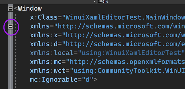
Take a look at the following highlighted item. (It's in a WinUI3 project, but that doesn't matter.) 

A partial XAML file screenshot showing a new outlining node next to xmlns multi-line attributes

Yes, it's a new outlining node.

Guess what it can be used to collapse... or look below.

As with the above but all the lines containing xmlns declaraions ahve been collapsed behind a comment reading "[xmlns...]"

Isn't that nicer?


And for completeness, here's the original document from above with the 5 long lines all now collapsed behind one short placeholder. 

Partial XAML screenshot with 5 xmlns attributes hidden

I'll make this publicly available soon.

Of course, this doesn't address the duplication across files and the possibility of issues due to aliases being used inconsistently across files within a project, but I have separate ideas for addressing those.

But for that, and details of other ways to XAML can be improved (without needing to make changes to the frameworks being used,) stay tuned for future posts.