I tried to start this discussion on Twitter & Fosstodon but didn't do a good job of describing things with limited words.
I'm trying to find examples of the summary representation of a UI (could be a web page or a native app) which don't use a treeview.
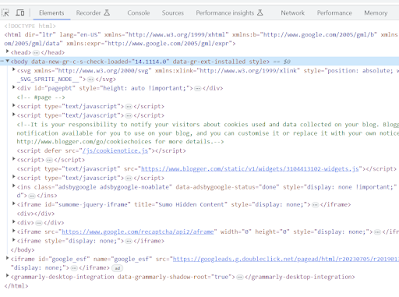
For instance, assuming you're reading this in a browser, open the developer tools (F12), and you'll see something like this in the Elements tab. All the triangles are expandable and collapse nodes. You can expand an entry to see its children. It's a basic "tree view" layout.
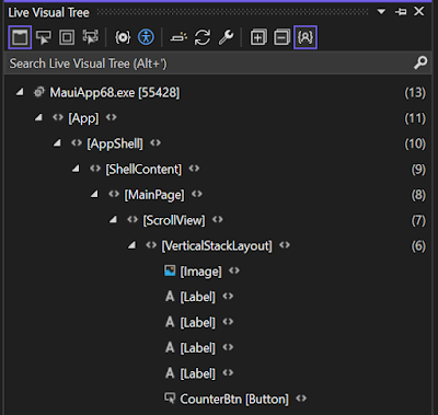
Or, for an app, here's the Live Visual Tree from Visual Studio
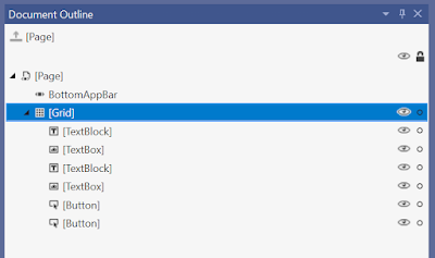
and the Document Outline
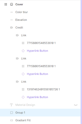
Or this from Figma:
They're all tree views.
I'm looking for examples of alternative UI for representing all (or part) of a UI "tree".
Got any examples?
I'm most interested in examples intended for developers that are clear and easy to understand. Or, at least, explained. Not different for the sake of it, but that are trying to communicate something different or in a different way.
My thought process was triggered when someone told me this is the only way this can (and has) to be done but couldn't tell me why. I'm also suspicious that this might be leaking the abstraction of the underlying data model when this might not always be the best or most suitable thing for the person viewing it.
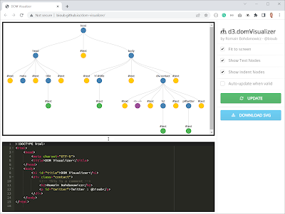
The only real variation I can find is like this (from http://bioub.github.io/dom-visualizer/), but all that really does is flip the axis.


I have created a few variations, but at end of the day they are all parent/child data displayed in different ways. For example, a vertical list of "parent" nodes dock to the left, but the childs appear in a secondary list, once I did them in a pop-out style, but I that is just copying a menu structure, and I have a drill-down style menu too, similar to menu again, but sub-menus appeared over the top of each other (hiding parent menu below it), that one was sort of ok and different... sorry, no screen shots, that's all work stuff I've done previously. Side note, I am starting to try the MAUI Accellerator, nice work :)
ReplyDelete