Version 1.2 adds:
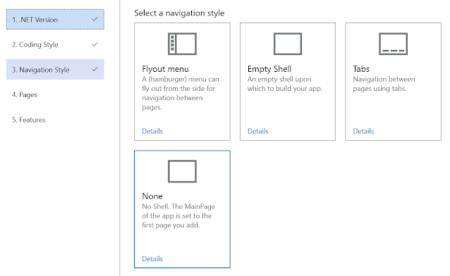
- 1 new Navigation Style: None (No Shell)
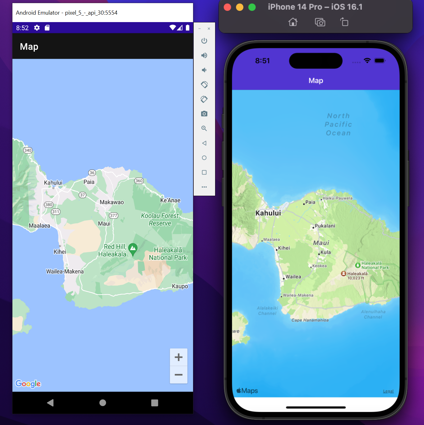
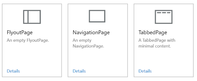
- 4 new pages: Map, NavigationPage, TabbedPage, & FlyoutPage
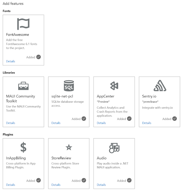
- 7 new features: FontAwesome, sqlite-net-pcl, AppCenter, Sentry.io, InAppBilling, StoreReview, & Audio
- Use of the newest versions of NuGet packages.
- Support OS-level Text Sizes in the wizard (for improved accessibility.
- Some bug fixes
- Improved testing (although you'll never see that)
- Images of new sponsors - a big thank you to all of them
- Support for all the sponsor images when the wizard is too small.
Let me break that down.
New Navigation Style: "None"
Don't want to use Shell? - Now you have that option.
New Pages:
If you're targeting .NET 7.0 you can now create a page with a map on it (and the relevant package referenced and configured in the app Builder.)
This means you can easily create the following on Android & iOS.
But not on Windows--because it doesn't (yet?) have a native map control. :(
If you're not using Shell, you may also want to use one of the page types that aren't supported by Shell. Now you can:
New Features:
There are lots of new features that have been added.
Most of these add references/files and do essential configuration.
Hopefully, this provides an idea of what's possible and hints at where I'd like to go with this in the future.If it gives you ideas for what you want to see added to this list, please create a suitable issue.
Updated NuGet package references:
I find it very disappointing when you create a new project, and the first thing you need to do is update all the referenced NuGet packages to pick up the latest features, fixes, and security patches.
Well, not here. Everything
Support for OS-level text sizing:
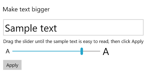
In the past, if someone had configured Windows to make text larger, like this:
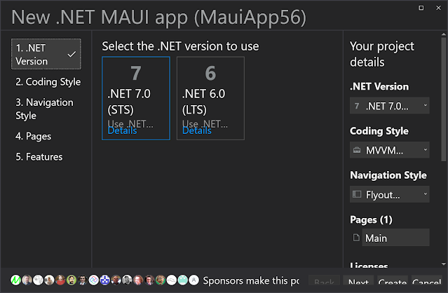
Then the wizard could end up looking "less than ideal." All the buttons are at least accessible, even if you can't read all the text.Most of this UI had come from Windows Template Studio and had design and accessibility reviews by the Visual Studio team. I was surprised this was an issue.
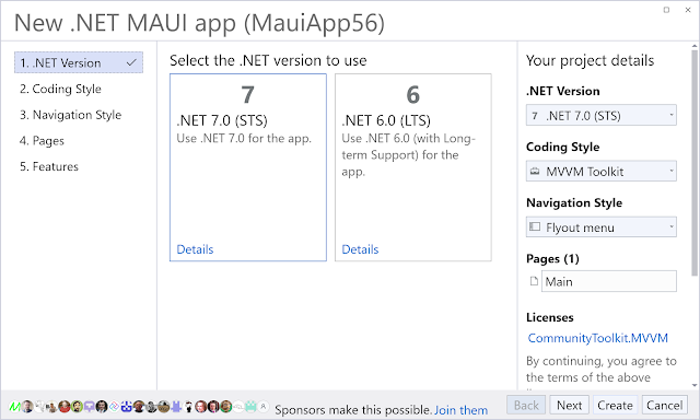
But, now it's not:
This isn't something I've ever considered previously. For the most part, addressing the issues was easy, but some things were harder than I would have hoped. This includes testing the related changes. I guess that part of the reason this hasn't been noticed before is that there are no automated testing tools for verifying this behavior, and to manually test requires changing an OS setting. Hopefully, this will change in the future.
New sponsor images & Improved handling of so many sponsor images:
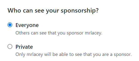
Having a lot of people sponsor me via GitHub is a lovely thing. In appreciation of this, I tell them how to remove the prompt to become a sponsor that is shown in some extensions. And if their sponsorship isn't private, I add their avatar to the bottom of the wizard.
Like this:
However, when the wizard is made smaller, some of those images are obscured.
Hey, I'm not complaining. This is a nice problem to have, and I want to respect all my sponsors, not just those displayed on the leftmost edge of the screen.
So, now this happens when the screen gets smaller:
Yes, I have wasted several minutes watching as things overlap when the available space is reduced.Please download version 1.2, try it, and tell me what you think. (If it's good, leave a review on the marketplace so others can see it too.)
Then, if you have suggestions for other things I can add, head over to the GitHub repo and create, upvote, or comment on a suitable issue.
