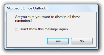
You've probably seen options like the one above used throughout the software you use.
It might be clickable text like that shown above or as an option with a CheckBox for you to check to indicate an answer you want to always be used in the future.
In theory, this is a good option to have.
As a general rule, you don't want to repeatedly prompt the person using a piece of software to give you the same information over and over again.
Similarly, you don't want to be telling the person using the software the same thing over and over again. They might not need to be told every time and you're likely to annoy or frustrate them if you do.
They might also start(?) ignoring any messages like this and inadvertently miss/ignore something new and important as it looks like something they've seen before.
[Aside: information, warning, and error messages should always be easy to distinguish between. Don't for example, make all of them the same color so the only way to differentiate them is to read the text.]
However, displaying a message like this raises questions for the person using the software.
- What is it that won't be shown again?
- Is it the exact, specific scenario, or all ones like it? (If the message is about one account/file/project/etc. will selecting this option stop it from being shown again for all accounts/files/projects/etc. or just this one?)
- Does my answer apply to all variations of the displayed message/scenario?
- Does it include displaying the message only in the same circumstances that caused it to be shown? (What if other circumstances or scenarios also warrant showing that message? I might want to see the prompt then.)
- Could the same (or very similar) message be shown for a different scenario?
- What if I want messages or prompts like this to be shown again? (at some point in the future.) How do I (re)enable that?
Yes, I'm someone who can often look at prompts with the "don't show this again option" and think about the possible future scenarios where it might be useful to get that message again. It's often easier for me to just ignore that prompt than try and figure out exactly what selecting the option might do.
When showing such an option, I can see that you're trying to be helpful but now you're adding complications and asking me to make a decision where I don't know the consequences of each answer.
Ideally, the software a person is using should give that person confidence and not raise doubts or questions about the thing you're doing to try and help them. Admittedly, for very large and complicated software that won't always be easy.
I'm not trying to argue that you should never use a prompt like that shown and described above. They can be very useful.
I'm saying that you need to consider the use of these messages and test they are understood by the people using the software. You want your improvements to actually improve things for the people using the software. Adding more prompts and options isn't always the best answer.


