Shh. Here’s a secret. I think there’s a part of me that wants to be a hipster. It must be true because I sometimes work in coffee shops — just like the cool kids.
This morning I went to town to do some writing in Starbucks. I go there quite a lot. Enough that many of the staff know my name and my usual order. Also, for the sake of this story, enough that I have a Starbucks card to make payments and collect stars (for rewards including free drinks.) Because I’m me and because they have one I also have the app version of the card on my phone.
Here’s what happened today:
- I entered the store.
- There was no queue — yay!
- Went to the counter and gave my order. (It was someone I didn’t recognize serving.)
- I launched the app on my phone and was presented with a screen that showed I wasn’t signed in. :(
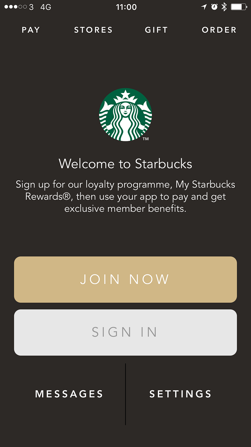
- I quickly tried to sign in after giving them my order (Venti, vanilla, Latte if you’re interested)
- Sign in failed.
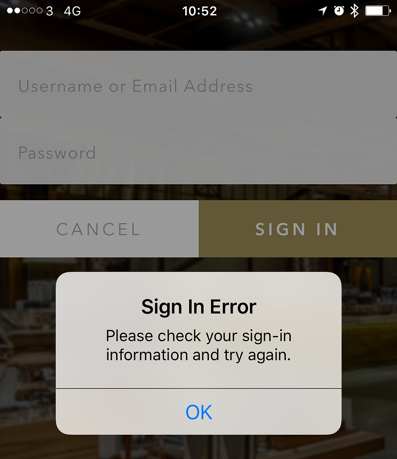
Side note: notice the mixed use of “sign in” and “sign-in”. Don’t do that. Be consistent.
- I go to re-enter the password but see my email address has been deleted. (It’s hard to check something that’s been deleted.)
- I mutter something under my breath.
- The barista at the till looks at me waiting for payment.
- In frustration, I put down my phone and take out my wallet.
- I hand them my card while mentioning that “the app logged me out.”
- They say that “that’s happened to a lot of people this morning”.
I wonder how many people, at this store and across the country, have been affected.
That’s people who’ve been frustrated by the fact that what should have been a quick, simple process wasn’t.
I wonder how much it delayed people during busier periods earlier this morning. That’s individuals affected by the delay to them as they have to log in again. Also, people kept in queues longer while those in front of them struggle with the app. Was it enough for anyone to miss a bus or train? Was it enough that people left the queue early because it was moving too slowly?
Because I’m me, I wonder what had happened in the app and decided to take a few moments to investigate and see what lessons can be drawn from this.
As the people using an app are the most important factor in the UX of an app, let’s start there.
It’s not good. The experience created negative emotions towards the brand. I was made to feel frustrated and disappointed that:
- paying for my coffee which is supposed to be simple and frictionless wasn’t.
- I had to enter my email address more than once for no good reason. (They obviously don’t care about unnecessarily wasting my time.)
Ok, so what about the app?
My initial assumption that as the phone hadn’t been updated or rebooted since I last used the app the app must have been automatically updated.
A quick check and a helpful app store notification shows that’s the case.
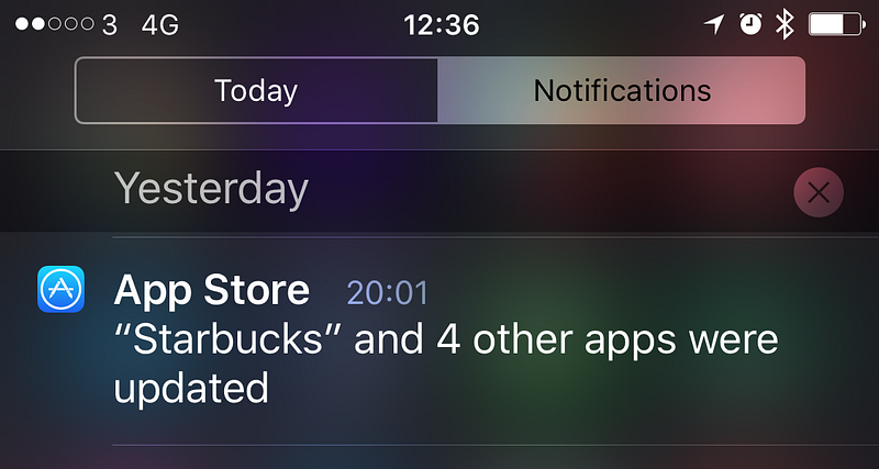
I have automatic updates turned on because I want to get the latest versions of apps as they become available.
Having auto-updates turned on is good for the publishers of apps too. When they release updates they want people using them as quickly as possible so they don’t encounter bugs that are fixed and can take advantage of new functionality. You don’t want to spend time creating an updated version of your app only to have no one use it. (This is why, in my book, I claim that update notification is the most important feature that every app should have.)
Ok, so there was a new version that was installed.
Now let’s see about that sign in experience.
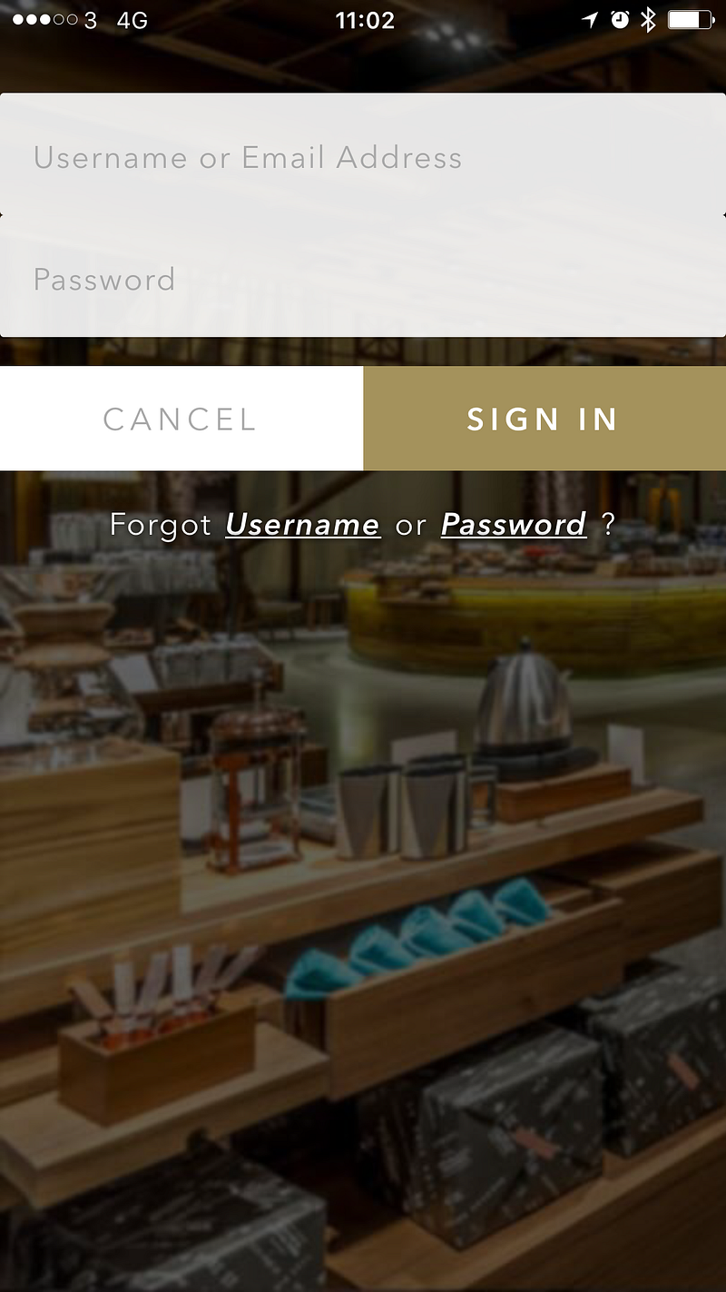
It looks like a regular sign in screen but let me poke at it a little.
“Username or Email Address” they appear regularly together on registration and sign in forms but they’re not always both needed. Well, email addresses are normally needed. But usernames? Not so much. As a credential for identifying myself to the service, an email address has the dual benefit of being unique and a token for contacting me outside of the app/service. I can’t think of any good reason for needing a username for my Starbucks account. If Starbucks want to address me they should use my actual name (which I told them when registering.) If this was an app that would allow me to connect with other people who use the app then a username would be a good, simple way of identify different people. For instance, on Twitter I have the username@mrlacey. You can use this to find, mention, or message me. It’s much easier than trying to differentiate me from all the other Matt Lacey’s in the world and it doesn’t make anything potentially private about me public. But I don’t communicate with other people who are using the Starbucks app. So, why do I need a username?
Maybe I can create a username to make it easier to sign in.
But (I think) this is only the second time I’ve logged into the app. Why add something I need to remember to perform a task I rarely have to do? I don’t know what my username is. I can probably guess but don’t want to have to. I know what my email address is so why wouldn’t I always use that?
If I’ve forgotten my Username there’s an option for that.
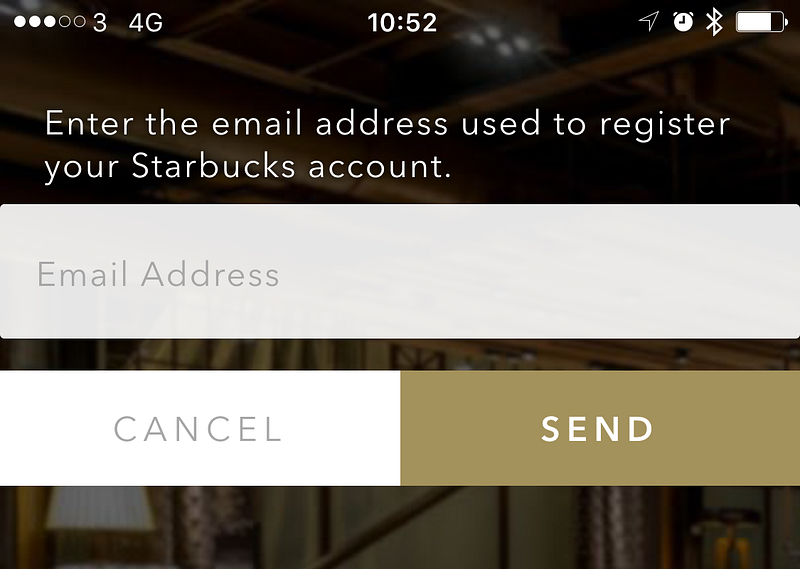
If I’ve forgotten my username I can use my email address to recover it. This is redundant!
The flow for recovering a forgotten username is:
- Select ‘Forgot Username’ option
- Enter email address
- Go to email client and (when the email arrives) retrieve the username
- Return to the app and enter Username and password to sign in
Or you could just ignore the username all together and log in with email address and password. The above flow requires entering them both anyway. It just adds a lot of extra, unnecessary steps too.
“Fun” side note: While writing this I went through the ‘Forgot Username’ flow as I was curious what my username was. It turns out it’s the same as my email address. There’s an acronym for this which starts with ‘W’ and ends with ‘F’.
What’s my username good for? I’m not sure.
While I’m here, let’s look at the forgotten password flow.
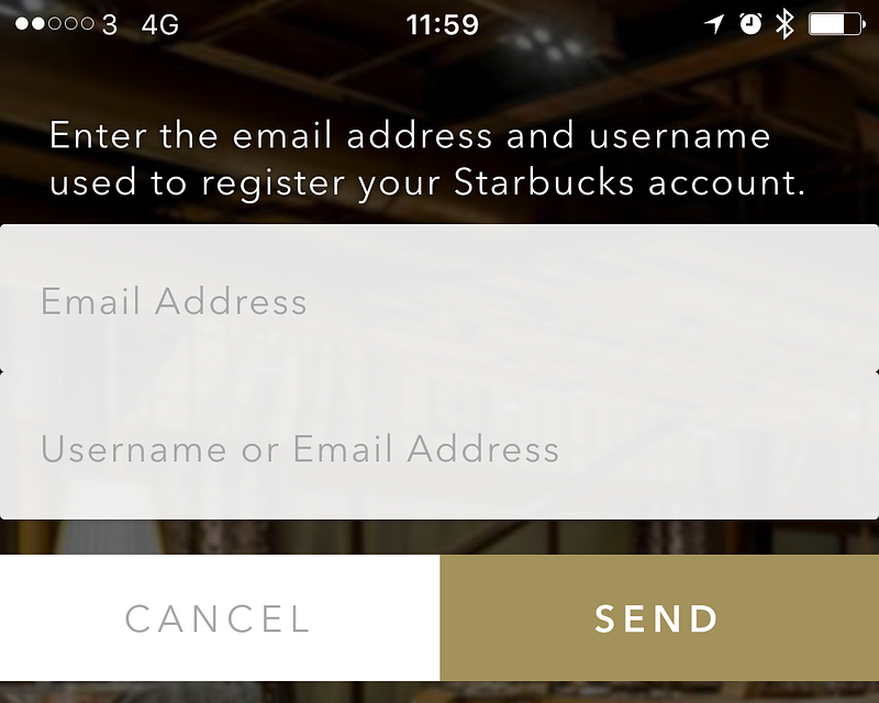
What the what!?
I need to enter my email address and my “Username or Email Address” to recover my password. So, can I enter my email address twice? Or is the label on the second text entry wrong? Either way, I’m starting to have serious questions about how or if this was tested. And the process that led to this situation.
Maybe the username exists as a way to try and prevent the malicious validation of email addresses registered with the system by deterring the automated, brute force entry of values in the password recovery process. If that’s what’s happening, it’s trying to solve the problem in the wrong way and is undermined by the username recovery option.
Despite what you might be imagining based on the above I manage to correctly sign in with my second guess at my password.
Now I’m logged in and using the app again, what’s new in this version?
A quick scan of the different parts of the app and I don’t see anything obvious.
I wonder if there’s any details listed in the app? ‘Settings’ is where I’d normally expect to find this (if it exists.)

Sadly, there’s just a version number. I don’t know what version I had before so this doesn’t tell me much but it looks like a small update (based on the number) so I wouldn’t expect much to have changed.
Let’s see if the store listing can tell me any more about what’s changed?
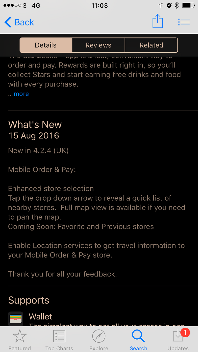
It can tell me something, but it seems little has changed. Just small changes relating to store selection and the displaying of maps. These are not features I use. This means I went through all this and got nothing from it apart from something to write about in this post.
Oh, they say “Thank you for all your feedback.”
Give all the above, what can be learned from this experience:
- Don’t force a person to re-authenticate with an app after it has updated.
- Don’t let an update cause saved data (including access tokens or cached credentials) to be lost.
- There is no functional or security related reason to delete an email address after a failed login attempt. It only ever creates more for the person using the app to do.
- Only require people to create a username for your service if they’re going to use it to communicate with other users of your service.
- Be sure that the labels for what people can or need to enter are correct.
- Use terms and labels consistently. (e.g. Don’t mix use of “sign in” and “sign-in”.)
- Don’t add arbitrary complexity on the assumption that it will help improve security.
- Test your registration, sign in, and credential recovery options thoroughly.(If you’re not confident in doing this then you could ask or hire me to help.)
- When an app is used for the first time after it has been updated, acknowledge the update and provide access to details of what’s changed.
- Make it easy (and obvious) for the people using the app to submit feedback.
- Bonus: I can tear apart and find issues with any app. ;)
The reason I write posts like this is because I don’t want to have experiences or use apps like what’s detailed above. I don’t just want to complain but help people learn how to identify and fix such issues. If you can see other people making mistakes and learn from them it will, hopefully, help you avoid similar issues in future.


0 comments:
Post a Comment
I get a lot of comment spam :( - moderation may take a while.